 Code of Conduct
 Ethical Mgmt
 Speak-up Culture
 Latin America
 Asia Pacific
 FX Global Code
 Financial Services
 North America
 Europe
 Middle East
 MSBs
MSBs FinTech
 Insurance
 Investing
 Casinos
 Retail Banks
 Manufacturing
 U.S. National
 Canada
 California
 New York
 Illinois
 Connecticut
 Maine
Maine Delaware
 Retail
 Warehouse
 Healthcare
 Animated
 Billing & Revenue
 IT & Admins
 Leadership
 Ontario
 British Columbia
 UK Induction
 Australia & NZ
 Workplace Violence Prevention
 Canada
 Italy
Italy Active Shooter
 AI & Workplace
 Corporate Ethics
 Whistleblower
 Gvmt Contracting
 Export Controls
We recently transitioned our brand colors to meet WCAG standards. If you're interested in accessibility accommodations, we're passing on our tips and tricks to make an easy transition yourself.
This includes people who are disabled, the largest minority group in the world. In fact, most of us will be part of this group at some point in our lives, so it’s important to consider this as a main use-case in any product you design! As a company focused on inclusivity, we decided from the outset that accessibility was a core to our brand, and it got us thinking critically about how to make every element of Ethena as accessible as possible.
All of our content is designed at the forefront with Web Content Accessibility Guidelines (WCAG) in mind. From graphic novels, to videos, to interactive trainings, we've done countless hours of research alongside consultants in accessibility testing. This included conducting user research with individuals who primarily use screen readers to navigate websites (and in our case, take compliance trainings), and the insights we have gained have been invaluable.
Today, we are going to dive into how we made an accessible color palette for our trainings. One that reflects our brand, is WCAG compliant, and is easy to apply and use!
Why you should care about accessibility
During this process, we conducted a lot of research to determine the best way to create accessibility-friendly trainings that accommodate all trainees. Our first step was to create an accessible color palette that was easy to use. We are sharing our solution here in hopes that more teams can use this approach to increase accessibility in their products too!
What is WCAG?
Taken from the Web Accessibility Initiative (WIA) website, Web Content Accessibility Guidelines (WCAG):
Defines how to make web content more accessible to people with disabilities, and older people with changing abilities due to ageing/aging. WCAG provides a provide common definition for accessible content, a benchmark.
Accessibility is essential for developers and organizations that want to create high quality websites and web tools, and not exclude people from using their products and services.
Our 4-step approach to accessibility with product design and brand colors
Step 1: Get in alignment
Before we started picking colors, the design team aligned on a few principles:
- Brand
We love bright, fun, colors, and we wanted freedom to use color in our designs. We didn't want a rigid palette with limited applications, and we didn’t want to create a lot of rules that we would inevitably break.
- Useability
Our palette had to be accessible. Specifically, the colors we used had to meet or exceed with AA Web Content Accessibility Guidelines (WCAG) when applied to a product or layout. Even better if we could come up with some general rules to ensure color was always used in an accessible way. This would make us faster and bring accessibility considerations into our normal product workflow, a huge undertaking!
Step 2: Where we started
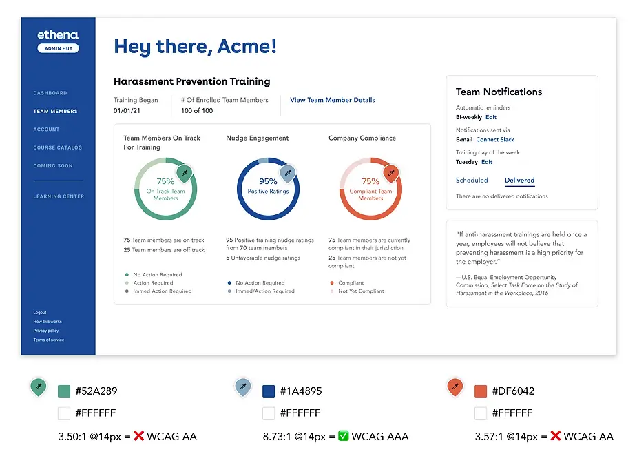
Web Content Accessibility Guidelines (WCAG) specify specific contrast ratios for different levels of accessibility. Above is an outdated view of our dashboard where some of our colors are not making the grade.
This meant that our original color palette wasn't supporting our principle of inclusive training to all. Although we loved our current brand colors, the color palette was limited and difficult to apply in a way that met accessibility standards.
Unfortunately our current color palette was pretty limited and only 2/6 colors were AA WCAG compliant for use with white text (something we do a lot in our branding).
Step 3: Define color rules and guidelines
The design team also debated how and where we would apply color. In the product, we agreed that color needed to be used very carefully since it would be associated with things like errors, buttons and success notifications. We also used colors in charts and data visualizations where color tends to imply a certain meaning; for example, we use red to indicate when learners are behind on their learning and blue to indicate when they are caught up.
The marketing team, however, had a much more varied and free use of color. They wanted to use specific color combinations to brand certain courses or indicate different sections in a sales deck. Away from the product, colors like green and red can simply mark a new chapter in a deck, and we agreed that we didn’t need to be as prescriptive about usage in those instances.
With these rules in mind, we created a new palette with awesome accessibility considerations, designed for real-world usage!
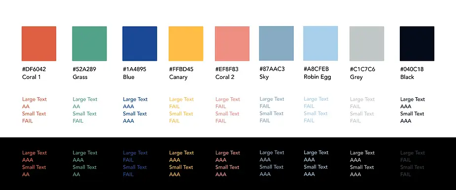
Step 4: Picking our colors

We created ten shades of each color using a tool called Huetone, created by designer Alexy Ardov. We found this tool to be much more precise when picking colors. It also worked with the design tokens plugin in Figma, making it really easy to pull into our working files!
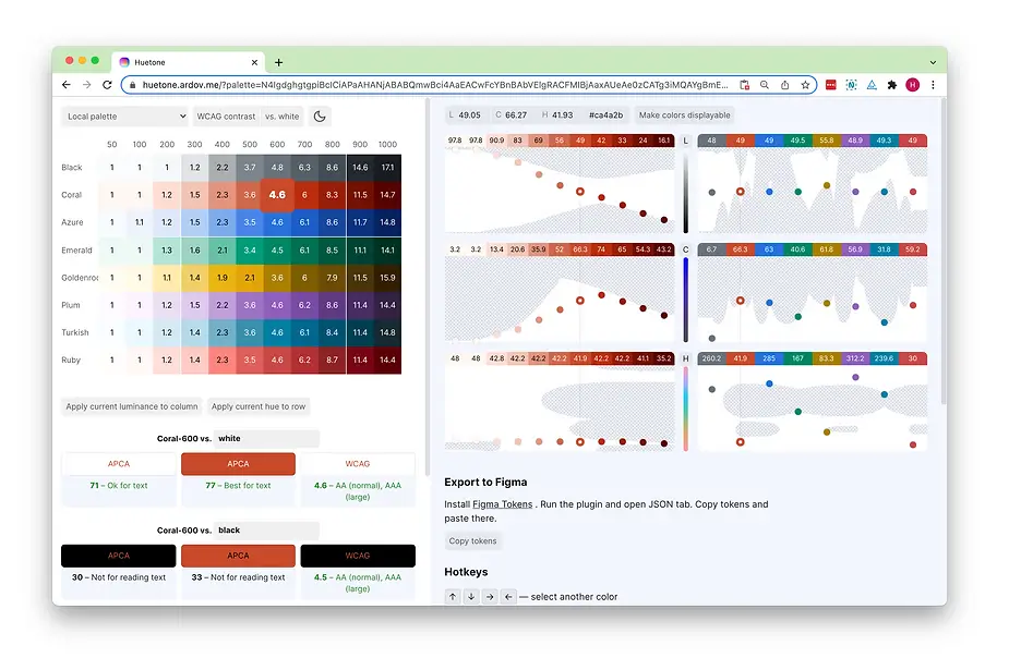
Above is a screenshot of Huetone in action. As a rule, the values 600-1000 meet AA WCAG standards when laid on white backgrounds, and the values 100-500 meet AA WCAG standards when laid on black backgrounds. This rule is helpful, but it does break down when you begin to apply colors on top of each other.
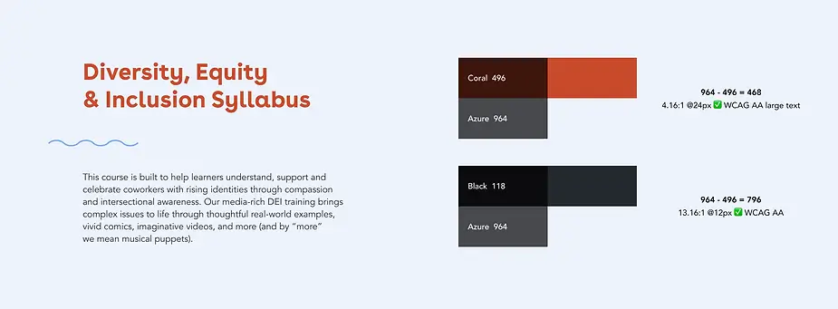
We knew that these colors would often not be used on pure white or black. Luckily, during our research, we discovered Amplitude’s fantastic blog post discussing their color system. They had the same issue we did (colors not always being used on black or white), and they created a very clever solution.
Amplitude calculated each of their colors’ luminosity, a value that allows you to compare different colors by subtracting one luminosity from the other. By subtracting the luminosity of the two colors we use, the difference will easily tell us if the contrast meets accessibility standards.
A difference of . . .
- 361 ✅ WCAG AA large text
- 495 ✅ WCAG AA
- 640 ✅ WCAG AAA
You don’t have to be good at math to do this calculation! We created a calculator to help us determine the luminosity for each of our color swatches and compare two color values. You can give it a try here.
The result: a more inclusive compliance training product
We had wanted a color palette that supported our brand, was accessible, and allowed us to design inclusive product trainings as well as our marketing efforts. The color palette we came up with supports our use case and taught us a lot about accessibility and color use best practices in general.
Have you ever designed products with WCAG in mind? Or are a marketer who needs to select a brand color palette for the first time? We hope these tips and our findings can help you in your efforts as we all do our part in making the web and product design more inclusive to all communities.
Want to join our team and be a part of this fascinating work? We are hiring positions in design, product and engineering. Apply online to join our team today!
And if you're interested in seeing how we apply accessibility to our training content, get in touch with our team, or check out a sample of training.